Career Clip
Breakdown

A calmer way to navigate the job search.
Career Clip turns a scattered job hunt into one visual system: every application, the stage it is at, and the next thing actually worth doing.
Role
Product Designer · UX Engineer · Developer
Focus
Product strategy, UX/UI, interaction design, development
Platform
iOS and Android · React Native / Expo
Status
In development · local beta

The problem
The search stops being a search and turns into an admin job.
Past the first twenty applications the hard part is no longer finding roles. It is remembering what you already did: who replied, what stage each role is at, and which thread has gone quiet.
01
The spreadsheet
Accurate the first week. Out of date by the third, because updating a row is never the most urgent thing.
02
The inbox
Rejections, scheduling and recruiter threads live next to everything else you get sent.
03
Twenty open tabs
Job posts stay open because closing one means losing it. The posting expires anyway.
04
Memory
The part that fails first, usually right before someone asks how the search is going.
This started as an observation, not a brief. The same sentence kept turning up wherever graduates talked about looking for work:
“I’ve applied to 50 jobs.”
“I’ve sent more than 100 applications.”
“I can’t even remember where I’ve applied anymore.”
An enormous amount of work, with almost nothing tangible to show for it. That contradiction is where the product started, and it is the reason the Clip Card exists at all.
I wanted Career Clip to answer one question immediately: where does every application stand?
Positioning
Not another job board.
Career Clip doesn’t need to compete with LinkedIn or Indeed for job listings. It handles the part that starts once you’ve decided a role is worth going for.
Everywhere else
Helps you find jobs
Job boards, company pages, recruiters and referrals all end at the same place: you have applied, and now it is your problem to remember.
Career Clip
Manages everything that happens because you are looking
The record of where you applied, what stage it reached, what you sent, what came back, and what all of it adds up to. It gets more useful the longer the search runs.
Product principles
Four rules that settled most of the arguments.
Every screen in the product had to earn its place against these. When a feature and a principle disagreed, the principle won.
Clarity
Know where everything stands
One glance should answer the status question. No counting, no cross-referencing, no scrolling to be sure.
Low friction
Updating takes seconds
If logging a change costs more than the change is worth, people stop logging. Capture had to be near-instant.
Calm
The interface adds no pressure
Job searching is stressful enough. No streaks, no scores, no red badges for being human.
Progress
Effort stays visible
Long searches feel static. The product shows movement that already happened, not just what is outstanding.
The system
One product doing four jobs.
Capture a role, keep it current, understand the pattern, and carry something out of it. Each surface answers a different question, and none of them ask you to maintain a database.
Home
What changed, and what needs you today
Attention first, then the pipeline snapshot, then recent movement. The order matches how people actually check in: the overdue thing before the summary.
Clip Card
Making invisible effort visible

Career Clip
Clip. Track. Get hired.
Applications
Search, saved views, stages

Insights
Pattern, not a scoreboard

Capture
Two ways in, both reviewed

The loop
The job is found somewhere else. Everything after that happens here.
Career Clip does not compete for job listings. It starts the moment a role becomes interesting and carries it through to something worth looking back on.
01
Find
The job lives somewhere else. A board, a careers page, a recruiter.
02
Clip
One action brings it in, before the tab closes.
03
Track
Stage, dates, source and notes stay with the role.
04
Progress
The status changes as things actually move.
05
Understand
Patterns across the whole search, not one row.
06
Share
Effort becomes something you can actually show.
Stages an application moves through
Saved
Applied
Assessment
Interview
Offer
Closed
Evolution
Where it started, and what it became.
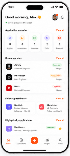
The first version solved the tracking problem but still read like a database. Later passes went after hierarchy, speed and visual noise, and removed things that were never connected.
01 · Home
Attention moved above the summary
The early build opened with a five-metric snapshot. Useful, but it never told you what to do next.
Needs attention was promoted to the top, grouped into Overdue, Today, Upcoming and Needs a date.
Snapshot tiles grew into larger scrollable targets instead of a cramped five-across row.
Early build · June
Current build
02 · Applications
A list stops working at scale
Filter chips alone were fine at twenty roles and useless at a hundred. Search came first.
Saved views replaced setting the same filters again every week.
The list was virtualised. The earlier screen rendered every record at once.
Result count and active-filter count are always visible, so a filtered list never reads as an empty one.
Early build · June

Current build
03 · Capture
Cutting the routes that were not real
The early screen offered four ways in, including screenshot import and Gmail. Two of them did not exist yet.
Anything without a working capability behind it was removed rather than shown as coming soon.
What was left got a clear promise: nothing is saved until you review and confirm it.
Early build · June

Current build
Building it
Designing it was only half the work.
Career Clip isn’t a prototype of an app. It is the app: written, debugged, tested and running on a device. I used AI tools to move faster through exploration and boilerplate, but the product decisions, the interaction design, the debugging and the final build were mine.
React Native
Expo · Expo Router
TypeScript
Zustand
React Hook Form + Zod
Reanimated
react-i18next
Supabase schema + RLS
Vitest
EAS Update
The list had to be virtualised
Rendering every record in a scroll view was fine with test data and wrong with real volume. Moving to a virtualised list changed the screen too: search, result counts and sorting all had to keep working through re-renders and stay put during a session.
Local-first, with a real migration
Applications live on the device. Moving the stored schema from v1 to v2 meant reading v2 first, migrating a valid v1 payload once, and only removing v1 after the new write succeeded, with recovery from a corrupt v2 back to a valid v1 backup.
Accessibility was a code problem
Contrast was the easy part. The rest was semantics: roles and labels on icon-only buttons, 44–48pt tap targets, errors that get announced, and short text summaries for charts so a screen reader can read them.
design tokens · theme.ts
I kept the reasoning next to the values, so every token shows the constraint it came from.
Shipped state
218
unit tests passing
3
languages at key parity
5
core destinations
4
appearance modes
Light, dark, increased contrast and reduced motion are all honoured from system settings and from in-app preferences.
Iteration
Building the real thing exposed problems static screens never did.
Each of these seemed like a reasonable decision at the time, and turned out to be wrong once the app was running on a device with real data in it.
01 · Status
A board that could not be used as a board
Was
A drag-style status board that looked movable but was not, and could not be operated without a pointer.
Now
Renamed it to Status overview and added a proper move-to-stage control with undo. Same job, but it now works with assistive technology.
02 · Attention
“Needs attention” was a list, not a decision
Was
One flat list of everything overdue, which grew until it was as hard to read as the inbox it replaced.
Now
Split into Overdue, Today, Upcoming and Needs a date, each row carrying Mark done, Snooze, Not needed and Open.
03 · Import
Review asked for too much too early
Was
The import review screen presented every extracted field at once, so confirming a saved role felt like filling in a form twice.
Now
Cut to the required and uncertain values, with the rest behind progressive disclosure, and edited drafts now persist if you leave and come back.
04 · Honesty
Interface promising things the code could not do
Was
Screenshot import, Gmail import, subscriptions and support actions were all visible while none of them were connected.
Now
Anything without a real capability behind it was removed rather than labelled “coming soon”, and the beta says plainly that data stays on the device.
Also fixed on the way, none of which were visible in a mockup
profile editing crashing to a white screen
category reordering
keyboards covering input fields
the wrong application opening from a list
location text truncation
dropdown behaviour
salary and date inputs
quote editing
brand colour drift
The audit
I scored my own product 5.2 out of 10.
Partway through I stopped adding features and ran a full audit of the build: UX, accessibility, trust, data handling and store readiness. It didn’t go well, and that ended up being the most useful week of the project.
The finding
The interface was promising a level of trust and completeness that the app couldn’t actually deliver yet.
It looked like a finished product. Underneath, account creation was a local simulation, deletion and support rows did nothing, the legal copy still said it was a draft, and career data sat in unencrypted device storage.
What changed because of it
The roadmap stopped being a list of features. Everything before the next release is the infrastructure the interface had already been promising.
Priority areas
Trust
Security
Account lifecycle
Data lifecycle
Privacy
Localisation
Consistency
Target after the roadmap: 8.2. Being honest about the score was more useful than another round of polish.
The current build
Where it is now.
A local beta running on a device. No account, no cloud sync, and nothing left in the interface that the app can’t actually do.
Application detail
One role, one next action
Location, dates, source and categories sit under the role, and the next action carries a date with Mark done and Snooze right beside it.

Context
The things you forget first
People, interviews, materials and a sanitised copy of the job description stay attached to the application instead of only being in your head.

Dark mode
A palette, not an inversion
Insights
The pipeline as a shape

Your data
Exportable, and stripped

What I took from it
A product can look finished long before it is finished.
The screens I was happiest with were usually the first ones to break. A dense home screen looks confident in a mockup, but on a real phone at arm’s length it just looks busy.
Early on I was mostly working on screens, states and visual polish. The audit showed me that product design is also about data, trust, error handling, privacy and giving people control, and none of that shows up in a mockup.
Doing both the design and the build changed how fast I could work. When a layout problem turned out to be a data problem, being able to go and fix it myself meant I could solve it properly instead of working around it.
What it changed about how I work
Audit before adding
A week spent auditing my own product was more useful than a month of new screens.
Design the data, not just the screen
A lot of the layout problems turned out to be data problems.
Get it onto a device early
Assumptions that seemed fine in a mockup fell apart on a real phone with real content.
Future direction
Where it goes after the beta.
None of this is built yet. It’s the direction I’m taking the product, and the reason the data model already looks the way it does. Everything below is a concept, not something that shipped.
Not built
Clip it from anywhere
Adding a role should be the fastest thing in the product. A browser extension and a share sheet would make “clip it” a single action from wherever the job was found, rather than something you come back to later.
Not built
Let the inbox do the updating
Forward a confirmation, a recruiter reply or a rejection, and the tracker updates itself. The application record is already set up for it. What’s missing is safe parsing and a review step so nothing changes without you approving it.
Not built
Tailoring a CV to a posting
One master CV in the product. Point it at a saved job description and it emphasises the experience that role actually asks for, without inventing any. The generated version stays attached to that application, which answers the question nobody can ever remember: which CV did I send them?
Not built
A web half to the product
Mobile is for capturing and tracking. The heavier work belongs on a bigger screen: documents, CV versions, deeper analysis and bulk organising. One system, two places, each doing what it’s best at.
Career Clip
Designed by Tsepo Tsolo-Mohlakwana
Back to desktop